Here is a question worth asking your team this week: how long would it take to put the margin number that appears on your executive dashboard into the screen your operations team actually works in all day? Not a link to the dashboard — the number itself, filtered to that team's accounts, refreshed when they change a date.
In most organisations the honest answer is somewhere between six weeks and never. Not because the number is hard to compute — it already exists, on a dashboard, correct, signed off. It is hard because of where it lives.
The shape of the problem
A BI tool is built on an assumption: that the destination is its own canvas. Everything follows from that. The semantic model is internal. The query is generated on demand and thrown away. The result is rendered directly to pixels. There is no moment in the pipeline where a well-defined, addressable number exists for anything else to consume.
So when a second consumer appears — and it always does — the organisation has three options, and all three are bad.
| What teams do | Why it fails |
|---|---|
| Embed the dashboard in an iframe | The host application inherits another product's fonts, colours, interaction model and login. It looks embedded because it is not. And the data still cannot be reached programmatically. |
| Rebuild the query in the application | Now the same business measure is defined twice, in two languages, maintained by two teams. They will diverge. The only question is when somebody notices. |
| Export to a shared table | A nightly copy that is stale by definition, with no parameters, no entitlement and no record of who read it. |
The third option is the most common and the most expensive, because it looks like it works. It works until an auditor asks which of the two numbers is correct.
The numbers exist only as pixels on one tool's canvas. Reaching them from anywhere else means rebuilding the logic or screen-scraping the result.
The same numbers are a URL with typed filters and a stable response shape. A dashboard is one consumer of it. So is an application, an agent, or a partner.
What changes when insight has an address
InsightCompose starts from the opposite assumption to a BI tool: that the number will be consumed by something you have not built yet. Everything the platform does is arranged around making the number addressable, parameterised and governed — and then, almost as an afterthought, drawing it.
A data API is a saved query with declared parameters. It has a URL, a version, a published response shape, and a log of who called it. No model is involved when it runs: filters are bound, the statement is validated, the warehouse answers.
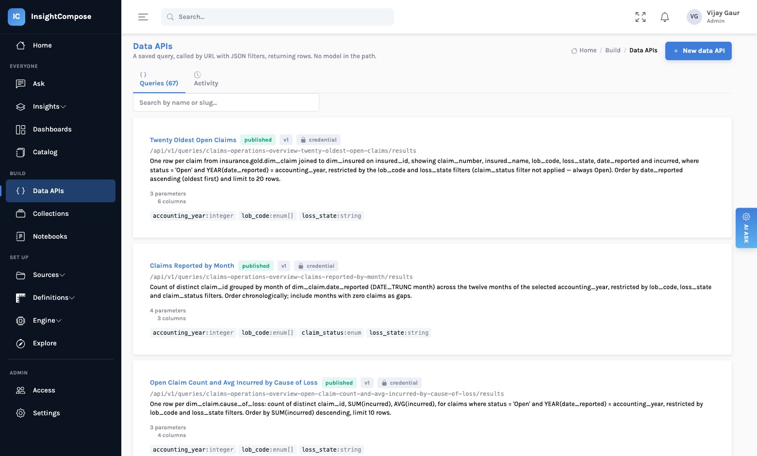
as_of, segment, top_n, region — and anything undeclared is refused rather than silently ignored.That single design decision — the query is the product, not the chart — is what makes the rest possible.
flowchart LR
    W[("Your warehouse")] --> Q["Data API
saved query + parameters"]
    Q --> D["Dashboard panel"]
    Q --> A["Your application"]
    Q --> G["An agent or copilot"]
    Q --> P["A partner portal"]
    style Q fill:#e6f7f2,stroke:#9fd8c9
Why this matters to the person signing the budget
1. The cost of the second consumer collapses
The expensive part of "put that number in the workflow screen" was never the number. It was the integration: agreeing the definition, rebuilding the query, arranging refresh, negotiating access. When the number already has an address, a contract and an entitlement model, that work is a fetch call.
2. One definition, provably
The most common analytics failure in a large organisation is not a wrong number. It is two numbers, both defensible, produced by different teams from the same warehouse. Because the dashboard panel and the application call the same endpoint at the same pinned version, they cannot disagree. Not by policy — by construction.
Publishing pins the version
When a dashboard is published, the query versions behind each panel are recorded with it. Someone republishing the underlying query later does not silently move a dashboard that other teams depend on. Consumers move when they choose to.
3. You can answer "who used this, and when"
Every invocation is logged — the caller, the filters as applied, the row count, the duration, whether it was cached, and whether it was refused. When someone asks why a figure in a board pack differs from the one in an operational screen, that question becomes answerable rather than archaeological.
Where the AI actually belongs
There is an understandable instinct, when a board asks for an AI strategy, to put a language model in front of the warehouse and let people ask questions. That has a place, and InsightCompose has it. But it is the wrong foundation to build an estate on, for one reason: a model that writes the query at request time produces a different answer every time it is asked.
So the platform draws a hard line:
| Surface | Model at request time? | What it is for |
|---|---|---|
| Data APIs | No | Numbers other systems depend on. Deterministic, versioned, logged. |
| Dashboards | No | Layouts over those same APIs. |
| Insights | At authoring | A narrative written once, verified, then served like any other artefact. |
| Ask | Yes | Exploration. How people discover which data API they should be asking for. |
The model's job is to author — to write a query, draft a dashboard, read a screenshot. Once a person has reviewed and published that work, it is an ordinary artefact and the model is not consulted again. This is what makes AI-generated analytics safe to put in front of a regulator: the generated thing is a reviewable definition, not a live improvisation.
The test to apply to any AI analytics tool
Ask what happens when the same question is asked twice, six months apart, by two different people. If the honest answer involves the model, the tool is a research assistant, not a reporting platform. Both are useful. Only one belongs under a regulatory filing.
What it looks like in practice
A dashboard in InsightCompose is a layout over data APIs. Every panel names a published query; the filter bar maps onto those queries' declared parameters. The page you see is assembled from the same endpoints an application would call.
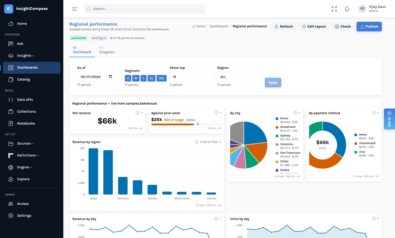
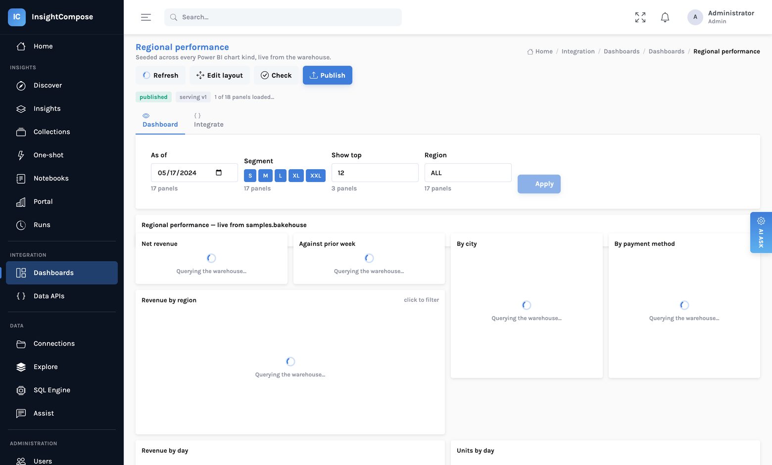
And each panel fetches independently, so the page fills in as answers arrive rather than waiting for the slowest query.
The question to take to your next architecture review
Not "which BI tool should we standardise on". That question assumes the destination is a canvas, and it is the assumption that will date fastest.
The better question: when a new consumer of our numbers appears — an application, an agent, a partner, a regulator — what does it cost us to serve them? If the answer is a project, the numbers are in the wrong place.
Read next
From a Power BI screenshot to a live dashboard — what the migration actually looks like, and what it honestly cannot do.