There are two familiar ways to build a chart on a warehouse. Write the SQL yourself, which is quick if you know the schema and impossible if you do not; or drag fields in a BI tool, which is easy and ends with a number that lives inside one workbook. We wanted the ease of the second and the addressability of the first, with a model on hand for the parts that are tedious to click.
The query builder: pick fields, the joins are worked out
Open a data API and choose Visual builder. Pick a table, click or drag its fields into the result, and the builder plans the joins from the relationships indexing already found — you do not draw them, though you can on the canvas when you want a specific path. Each column says what it is: a field as it is, a derived field (a function, a date truncated to its month, a CASE rule, a ranking, a split into columns), or a total, summed or counted per group. The rows underneath are what the query returns now, refreshed as you change it.
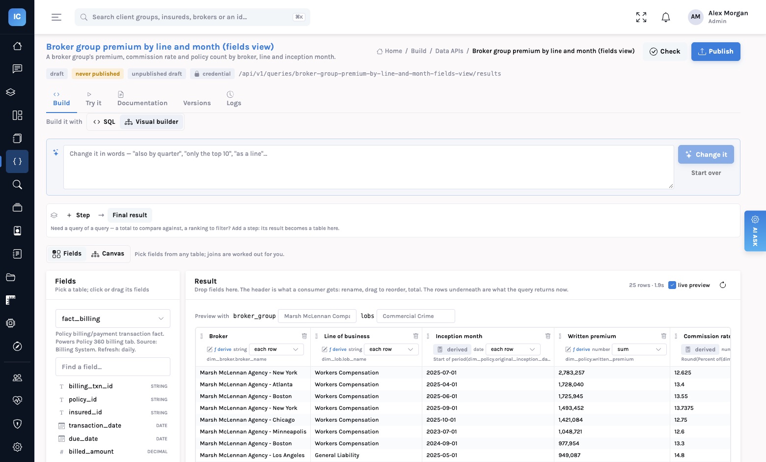
Two things make it more than a field picker. Steps: a query can use the result of another as a table, which is how you compare against a total, rank and keep the top ten per line, or filter on an aggregate, without writing a subquery. And Change it in words: “also by quarter”, “only the top ten”, “as a line”. The model edits the builder's spec, not the SQL; the spec is compiled, and if it does not compile the model is shown why and tries again. You see the change as fields and filters you can undo, not as a block of text to review.
One spec, your warehouse's own SQL
What the builder saves is a description of the query, not SQL. It compiles to the dialect of the connection
it runs on — Databricks, PostgreSQL, Snowflake, BigQuery, Redshift, MySQL, Oracle, SQL Server and
others — with parameters always spelt :name. So the same builder serves every
connection, and a data API built on one warehouse keeps working when its source moves to another. Filters
you mark as parameters become the data API's declared, typed parameters, exactly as if you had written
them.
The chart builder: shelves, Show me, and a sentence
On a dashboard, Edit layout › Build a chart opens the chart builder over any indexed connection. Dimensions and measures are listed from the table; drop them on Columns and Rows, drop a field on Filters, and use Marks for colour, size, label, detail and tooltip. Show me lists the sixteen kinds of chart and lights up the ones the fields can draw, with the best one marked. Or type what you want in the box at the top and let it fill the shelves.
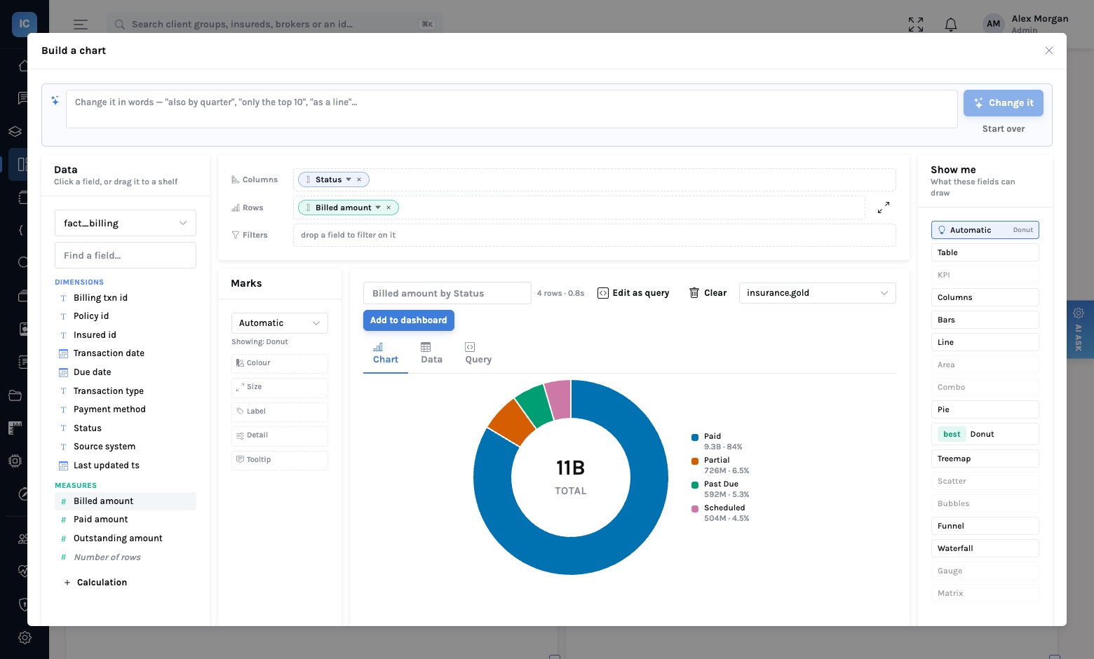
Edit as query opens the same chart in the query builder when the shelves are not enough. The Query tab shows the SQL it compiled to, for anyone who wants to check it.
Add to dashboard publishes a data API
A chart added to a dashboard is not a private object of that dashboard. Add to dashboard creates a data API for the chart's query, checks it, publishes it, and places a panel that reads it. The panel's number has an address, a version, declared parameters and a pinned response shape — the same as every other data API in the catalog — so the application that wants the same breakdown next quarter calls it instead of rebuilding it.
Another team re-creates it, slightly differently, and the two numbers disagree by the next board meeting.
It has its own version, parameters and grants. The dashboard is its first consumer, not its owner.
The principle
Make building easy enough that nobody needs to write SQL, and make what they built a governed endpoint anyway. Ease of authoring should not be paid for with a number that can only be read in one place.
Read next
Describe a dashboard. Watch it build. — the sentence route to a whole page. Your dashboards are a dead end for AI — why every panel should be an endpoint.