There is a moment in every analytics integration where somebody proposes an iframe, everybody agrees it is unsatisfactory, and it ships anyway because the alternative was six weeks of work. This is about making the alternative cheap enough that the iframe never gets proposed.
Why an iframe is worse than it looks
The visible cost is cosmetic: another product's fonts, spacing, colours and loading spinner inside your page. Teams accept that. The costs they discover later are the ones that matter.
- The data cannot be reached. Your application can display the chart but cannot read the number — so it cannot put it in a heading, drive a rule from it, or include it in an export.
- Interaction stops at the border. A filter in your application does not reach inside the frame, and a click inside it does not reach out.
- Two identity systems. Whatever you do with tokens, there are now two notions of who the user is, and they must be kept in step.
- Their release cadence is now yours. A change on their side appears in your product without passing your QA.
The alternative: a specification, not components
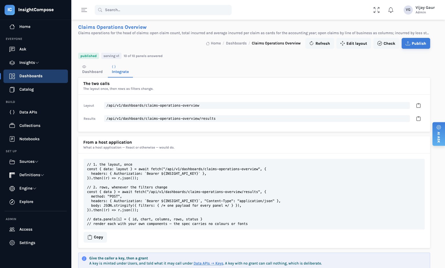
InsightCompose hands a consuming application two things and nothing else: a layout describing what to draw, and rows to draw it from. The application renders them with its own components.
Critically, the specification carries no colours, no fonts and no pixel sizes.
Geometry is grid cells. Formatting is semantic — currency, not
#e97627. Chart kind is bar, not a chart library's config object.
sequenceDiagram
    autonumber
    participant App as Your React app
    participant IC as InsightCompose
    participant W as Your warehouse

    App->>IC: GET /v1/dashboards/regional-performance
    IC-->>App: Layout — panels, chart specs, filter definitions
    Note over App: Render the filter bar and panel frames
with your own components
    App->>IC: POST /v1/dashboards/regional-performance/results
    IC->>W: One query per panel, in parallel
    W-->>IC: Rows
    IC-->>App: Rows per panel + provenance
    Note over App: Draw each panel in your design system
    App->>IC: POST .../results  (filters changed)
    IC-->>App: Rows per panel
What the layout actually contains
It is deliberately self-describing, so nothing has to be hard-coded on your side.
{
  "columns": 12,
  "results_endpoint": "/api/v1/dashboards/regional-performance/results",
  "filters": [
    { "name": "segment", "label": "Segment", "type": "enum",
      "multi": true, "values": ["ENTERPRISE", "MIDMARKET", "SMB", "PUBLIC"],
      "default": ["ENTERPRISE", "MIDMARKET"],
      // which panels this control actually changes
      "applies_to": ["revenue", "cost", "trend"] }
  ],
  "panels": [
    { "id": "revenue", "type": "chart", "title": "Revenue by region",
      "chart": { "kind": "column", "x": "region", "y": ["revenue"],
                  "format": { "revenue": "currency" } },
      "layout": { "x": 0, "y": 2, "w": 6, "h": 8 },
      // clicking a bar sets this filter — cross-filtering, as data
      "emits": [{ "on": "mark", "column": "region", "filter": "region" }],
      "query": { "slug": "revenue-by-region", "version": 3,
                 "columns": [{ "name": "region", "type": "string" },
                              { "name": "revenue", "type": "decimal" }] } }
  ]
}
Three details there earn their place.
applies_to — which panels a filter reaches
A filter bar in a host application usually has to be built by hand because nobody knows which controls affect which panels. Here the platform works it out and says so, so the bar can render itself — and a control that reaches nothing is caught before publishing rather than sitting on screen doing nothing.
emits — cross-filtering expressed as data
Clicking a bar means "narrow everything to this category". In this model that is not a special interaction: it adds a value to the same filter payload every panel already receives. A panel whose query does not declare that parameter simply ignores it.
So your application implements cross-filtering by reading emits, adding the
clicked value to its filter state, and asking for rows again — the call it already
makes. There is no second protocol.
columns and version — the shape, before you ask for data
Your components know what the rows will look like before the first request, and the version pins them. Republishing the underlying query does not silently change what your application receives.
One filter payload, many panels
The results call takes a single filter object and returns a result per panel. Each panel takes the filters its query declares and ignores the rest, which is what lets one filter bar serve a page where each panel filters on part of it.
Two properties of that endpoint are worth knowing about when you design your screen:
| Property | Why it is that way |
|---|---|
| A failing panel is reported in place | Seven working panels and one that says why beats one error that loses the seven |
| You may request a subset of panels | Refresh one tile without re-querying the page |
| Panels resolve in parallel server-side | A page costs about its slowest panel, not the sum of all of them |
| Every result carries its provenance | Version, filters as applied, freshness, cache state — so your UI can show it if it should |
A note on concurrency
Our own console fetches each panel separately so the page fills in progressively rather than waiting for the slowest query. Browsers cap concurrent requests to one origin at around six, which is the behaviour you want — the warehouse sees a steady handful rather than eighteen at once. If you prefer a single round trip, ask for all panels in one call; they still resolve in parallel on the server.
What you do not have to build
The point of the split is that the hard parts stay on our side of the line.
Render a chart kind with your components. Hold filter state. Decide what a click does. That is it.
The query, its parameters and bounds, entitlement per caller, version pinning, caching, row caps, timeouts, and the log of who asked for what.
The migration path this enables
For a team currently embedding a BI tool, the sequence that works is not a big-bang replacement. It is:
- Add insight where there is none. Put the AI narrative or a KPI into a screen that has no analytics today. Low risk, visible value, and it proves the integration.
- Shadow one existing dashboard. Rebuild it as data APIs and render it natively next to the embedded original. Compare the numbers for a fortnight.
- Swap the frame for components. When the numbers agree, remove the iframe. The screen is now yours — your design system, your interaction model, your release cadence.
- Let the APIs outlive the dashboard. The queries are now addressable by anything, which is the position you actually wanted to be in.
The property worth protecting
At no point does a number get defined twice. The panel in your application and the panel in our console call the same endpoint at the same pinned version. They cannot disagree, and nobody has to maintain the agreement.
Update, October 2026
The layout call now also serves dashboards that take a required parameter (a broker group a consumer must pass on every call), a panel can be an insight part with its narrative, and grants can be given to an Okta or Entra group as well as to a key. See Describe a dashboard and A catalog with a ledger.
Read next
Your dashboards are a dead end for AI — the strategic case, for the architecture review.